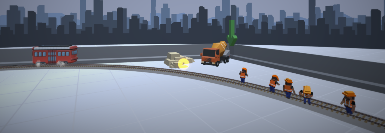
Coloriffic is a colouring game for kids which was recently released for most platforms. The game was made by a former student of mine who now runs NWE Soft, they have another educational game in the works too!

Regular readers of this blog already know that I care about education and the various forms learning takes. The release of Colloriffic made me realize that I haven’t covered educational games in sometime though and thought I should cobble together a post about what I’ve been looking at.
Here’s a collection of various opinions on making educational games that I’ve come across over the past couple of months that are worth noting.
For Educators:
The folks over at EdSurge have created a guide to playing games in school which includes classics like Oregon Trail and more recent enters like Minecraft.
EdSurge also has an optimistic article on using games research in education while pointing out the barriers to full fledged adoption.
Other studies also suggest that many educators find that games have a negative impact on student behavior and attention. In a recent survey by Common Sense Media, among those who say their students’ academic skills have been hurt by entertainment media, more than two-thirds point the finger at video games (68%), and 61% say video games have mainly a negative effect on children’s physical well-being.
Pearson Education recently sent out a press release exploring how a more digital pedagogical can improve the learning environment.
This is one example of deeper learning, which can serve as an inspiration for schools around the world. The report recommends for students, teachers and policy makers to take the following actions to embed this ‘deep learning’:
- For students – to define their own learning goals and push their teachers to be fellow
learning partners.- For teachers – to adopt an approach to try to learn from and with their students.
- For policy makers – to reduce negative accountability in favour of pedagogies and
assessments linked to deep learning.
For Game creators:
It seems that every educational game developer has their own approach to making an effective game, so if you’re new to making educational games you may want to explore these different approaches taken by experts in the field.
My own approach to making educational games is to make a good game first and make it educational second. I reach this conclusion because I’m also an advocate for inquiry based learning (AKA student-led learning). Sure enough, I’m not the only who thinks this way. Matt Blair goes into in detail on the matter in this article.
For example, when playing SimCity, you are learning important aspects of civic management and leadership, such as organizing an effective health care system or planning a highway system that allows your citizens to get to work faster boosting productivity which raises income which gives your city more tax income every year. The hallmark of a truly great educational game is if a player doesn’t realize he or she is learning the act of playing these games and succeeding will allow them to take away more then they could ever learn in a classroom.
There are, of course, other approaches. Dan White at Gamasutra uses rock climbing as a metaphor for the design process of educational games that get used in schools.
Then there are these guys who argue that happiness is all else in game design. Yet, for people with his approach I want to remind them that seemingly banal choices in the designing process can carry a lot of meaning.
Take this example from Rohan Harris and the simple act of cutting down a tree:
Early on the process, before much else was working, someone seeing me demonstrate the alpha said, “I like the way the trees regrow after a while. Can you remove them?”
This gave me pause. They regrew for gameplay reasons. Chop a tree down? It becomes a tree stump. Some time later, as we didn’t want to do the Minecraft-thing of seeds being then used to plant fresh trees, it will magically become a full-grown tree again (unless you manually remove the stump).
“Is this a statement,” I was asked, “on sustainability?”
I was rather shocked. It could at a stretch, I guess, be viewed as a statement against sustainable ecology. I just hadn’t thought about it as anything but a mechanic.
By contrast to the tree thing, in our game you can strip-mine your mineral resources away in a heartbeat, unless you plan will and leave enough around to build sustainable mines — and even that could be argued as a statement in favour of mining!

